'Van Helsing' contrasts with our idea, by the fact the protagonist is not actually shown in the opening sequence, and the opening sequence is nearly 8 minutes long, as well as being in a completely different location and time period. However it does have the same genre conventions, where the setting is dark and mysterious, typical of a supernatural gothic horror, alike to what we wish to create, as well as the element of mystery, where the protagonist (as not present) is unaware of what is going on in this scene. The characters aren't revealed as to who they are directly, and what their importance is to the story, alike to our idea, but is revealed through hints to the audience (such as with a very sudden flash of Dracula's true form in the lightening, similar to our idea of flashbacks to reveal more about the character through his actions). The characters are revealed towards the end of the clip, when Igor and Frankenstein's names are revealed and Dracula shows his fangs and bites Frankenstein's neck, which again has similarities with our theme of vampires, and the revelation of this theme towards the end of the opening sequence.
A lot of wide or panning shots are used throughout to set the scene, which we could take as inspiration for ours, with a few POV shots to show how Dr Frankenstein, who is scared of Dracula and trying to get away, is feeling and how he views Dracula (with low angle shots to show how the vampire is the superior, something we could use). There is no music, only the sounds of the footsteps and speech or breathing, something else that has inspired us for the sound of our opening, to build tension to keep the audience captivated by what they see on screen by wondering what is going to happen or what is going on in the first place.
*sudden flash shot to reveal more to audience*
*Dracula POV shot that is slightly high angle to make his victim look inferior, a technique we can use between our character and the person he has killed*
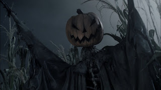
 It
also has several shots of the pumpkin head on the scarecrow, an
object that is relevant to other parts of the film which is revealed
to the audience at the start as a hint. To take inspiration from this
we can have a running theme of an object that is relevant to the
story in our opening sequence to give more hint to what the story is
about, and to make this relevant to our vampire theme, we can use
blood as our reference object.
SLEEPY
HOLLOW
'Sleepy
Hollow' is a Tim Burton film which can be an inspiration to my own
coursework. Although it is not a vampire film, it is supernatural
thriller/gothic horror that has an opening involving elements of
mystery and tension, where the killer isn't revealed fully throughout
the opening sequence, but hints at who it may be, which are all
techniques we could achieve in our film to make it look effective
like successful films such as this. Also relevant to our idea, the
opening credits actually feature an opening sequence of film rather
than just title credits.
The
setting is very dark, which fits it's theme, and the colours are also
very representative, such as the black carriage to connote death and
mystery. The victim who gets killed later in the sequence is wearing
pale colours, to represent innocence and the fact he is less
powerful, whereas the headless horseman, the supernatural antagonist,
is wearing black to also connote death, danger and mystery. These
features are important to portray in the opening sequence in order to
set the scene and the theme or the rest of the movie, an important
idea that we need to consider for our opening titles because it needs
to make clear the story of our film, due to our coursework involving
only making the one part of the film.
There
are a lot of camera angles that make the innocent man look inferior,
such as high angle shots and also POV shots from the antagonist
before attacking the victim – two techniques we can use to make the
victim in our first sequence look inferior and the vampire look
superior.
 It
also has several shots of the pumpkin head on the scarecrow, an
object that is relevant to other parts of the film which is revealed
to the audience at the start as a hint. To take inspiration from this
we can have a running theme of an object that is relevant to the
story in our opening sequence to give more hint to what the story is
about, and to make this relevant to our vampire theme, we can use
blood as our reference object.
This
film contrasts to ours firstly by being created by a large
international company, that is set in America, in the year 1799,
whereas ours will be set in present day England. However, the
techniques to create the theme we can still similarly use.
Danny
Elfman uses a combination of silence and slow music that crescendo's
to create tension and fear throughout the opening sequence, to keep
the audience hooked from the very start, which is something that can
inspire us for our film opening in terms of our audience.
In
terms of editing there aren't many effects, until effects are used
for the victim's head being chopped off, to keep the film looking
realistic, but to also make the killing scene a shock factor right at
the start of the film.
The actual credits of the film fade into the video in a white smoky effect, which is ominous looking and further connotes mystery and that something is 'not quite right' in the atmosphere. This shows how important the actual text is put into the opening sequence, and is something we need to consider to show representations in our video.
(text appearing in smoky effect ^)
DAYBREAKERS
'Daybreakers' is a vampire film that can relate a lot to our idea. The general opening sequence involves a young vampire girl writing a note or diary entry about what it is like being a vampire, and then going outside and waiting for the sun to rise - where the sunlight then kills her; she commits suicide because she doesn't like who she is and cannot change. This is similar to ours in the sense that our character cannot accept that he is also a vampire and cannot deal with it, however this isn't completely made clear in our opening idea because our protagonist is involved in the whole film so in our opening the hints will only be subtle. The credits of the film also differ, where the production team's names appear on a blank screen separate to film clips, and fade in to look mysterious, but our idea is to actually inco-operate the credits into the video clips as well as the cast, which this film actually does with the cast in the sequence after the opening scene, by animating names into different parts of the setting, an inspiration to our idea for our text.
The film is also created in association with Lionsgate, an independent film company that has been involved in many successful films of the genre we want to create, so this is another thing we can consider.
At the beginning in between the credits appearing, there is a short sudden shot of vampire bat, to surprise the audience and cause fear, and give implications about what is to come, and to break up the block text, another technique that can be considered. The first shot of the girl is a high angle/birds-eye-view shot, to make her look inferior, and powerless, but as she is alone, possibly powerless to herself, which would fit with the rest of the sequence. With the idea of a helpless vampire being an inspiration also to our film, shots like this can also be important to us. There are a lot of pictures of the girl looking 'normal' and human, implying she is not always or hasn't always been a vampire, which is an inspiration to our movie theme. The shots of the note/diary entry that the girl has written, are very zoomed in, with an editing technique where only certain words are in focus, such as 'never change', 'never grow up' and 'can't go on' which gives the implications that she is a vampire, and that she cannot cope with herself that way. Long shots in the dark of the girl, set the scene around her, to make it look a mysterious and set the dark theme for the rest of the film, which is important for the opening sequence, and something that we would need to consider for a successful film to show typical genre conventions. The showing of her different coloured eyes is the main revelation that the girl is supernatural or a vampire, when she shows her face full for the first time, and then when she burns in the sunlight, this is the shock factor for the audience before the appearance of the title screen. These two things are factors that inspired me most from this film for ideas in our film opening, that will keep the attention of the audience.
The general whole film also inspired me because of the modern day setting, involving vampires, with scientific elements including the vampires being the result of an 'outbreak' along with experiments and specialist blood for the vampires, which is the kind of thing that fits with the name of our film 'Porphyria' which is scientific theory about vampires.
Sweeny Todd
 The Sweeny Todd opening is interesting because it is all animated with CGI, which makes it separate from the rest of the film, and also something memorable to the audience, as well as giving a surreal, mysterious effect. The sequence follows one object - blood , which is associated with death, danger, gothic horror films, but also our theme of vampires, which is something we can consider. The use of following one thing around the whole sequence is a useful way of setting the scene, by revealing other things into the shot it reveals more about what is to come in the rest of the film, such as showing the barber's chair, but also a baker's oven, which hints to the audience that these things are connected, from the start. By making it's way around the rooms, it establishes the main setting for the audience, but doesn't show the whole rooms, which again gives a mysterious effect and keeps the reader wanting to watch more. The credits appear on screen within the film setting, like our idea, where the names come up on blank areas or objects of the clip, a technique to show how they are more included with the making of the film.
Sweeny Todd opening:
http://www.artofthetitle.com/title/sweeney-todd-the-demon-barber-of-fleet-street/
Sweeny Todd
 The Sweeny Todd opening is interesting because it is all animated with CGI, which makes it separate from the rest of the film, and also something memorable to the audience, as well as giving a surreal, mysterious effect. The sequence follows one object - blood , which is associated with death, danger, gothic horror films, but also our theme of vampires, which is something we can consider. The use of following one thing around the whole sequence is a useful way of setting the scene, by revealing other things into the shot it reveals more about what is to come in the rest of the film, such as showing the barber's chair, but also a baker's oven, which hints to the audience that these things are connected, from the start. By making it's way around the rooms, it establishes the main setting for the audience, but doesn't show the whole rooms, which again gives a mysterious effect and keeps the reader wanting to watch more. The credits appear on screen within the film setting, like our idea, where the names come up on blank areas or objects of the clip, a technique to show how they are more included with the making of the film.
Sweeny Todd opening:
http://www.artofthetitle.com/title/sweeney-todd-the-demon-barber-of-fleet-street/
(sources of images: Google images and screenshots of original film)


No comments:
Post a Comment